The tree has done the colour testing
An autumn leaf rarely settles for one tidy shade. A yellow edge meets green around the veins; a rust-coloured patch interrupts the middle. Those uneven transitions make leaves especially useful for choosing craft colours. They show how a palette behaves together, rather than presenting six unrelated pencils and asking them to form a committee.
Start with one leaf or a photograph, not the whole woodland. Choose a dominant colour, a supporting shade and a small accent. The restriction gives you something to work with; it also makes shopping for additional materials considerably less urgent.
Some colours were there already
The Woodland Trust’s explanation of autumn colour describes the pigments involved. As green chlorophyll breaks down, yellow and orange pigments become more visible; red pigments have a different story and can develop under particular conditions. The seasonal display is not simply a tree changing its mind about green.
Weather affects what appears and when. Avoid promising that a particular walk will produce a carpet of crimson leaves. A single partly changed leaf may offer more to investigate than a sweeping view, especially when you can still compare its green and yellow areas.
A current invitation to notice
The Woodland Trust’s September 2026 guide to autumn signs encourages looking beyond colour to other seasonal changes. That is a useful approach this October: record what is actually present rather than ticking off what the calendar says ought to be there.
For a colour study, write the place and date beside the palette. A second visit might reveal that the same tree has changed, or that nearby trees remain different. Keeping those observations turns a pretty selection into a small record of a particular place.
Borrow the balance, not every shade
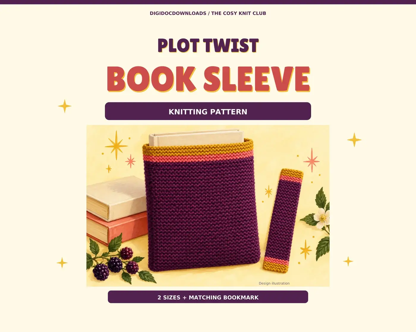
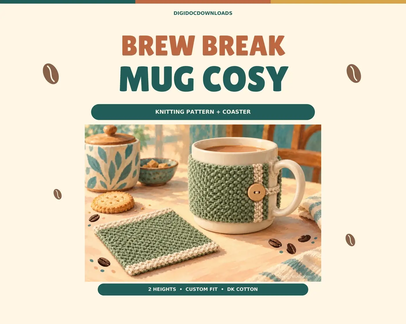
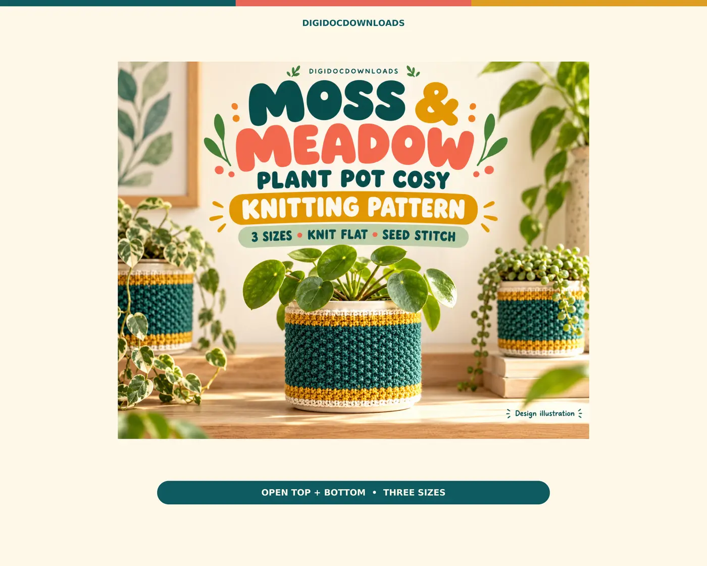
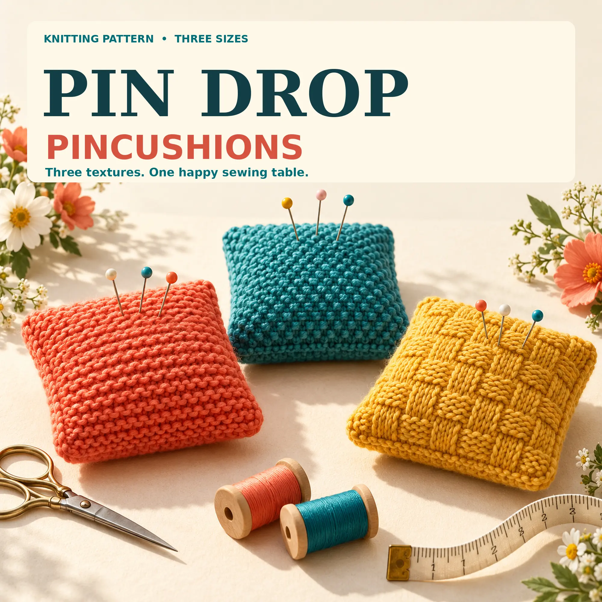
Suppose your leaf is mostly ochre, with olive veins and a deep red corner. Make ochre the main field, olive the repeating detail and red the accent. On a knitted project that might mean a large body, a narrow border and one stripe; on a colouring page, larger petals, foliage and a few small centres.
Test the combination on scrap paper or a swatch first. If every colour receives equal space, the result may lose the leaf’s useful hierarchy. The aim is not a botanical copy. It is to understand why one arrangement holds together.
Give children something concrete to compare
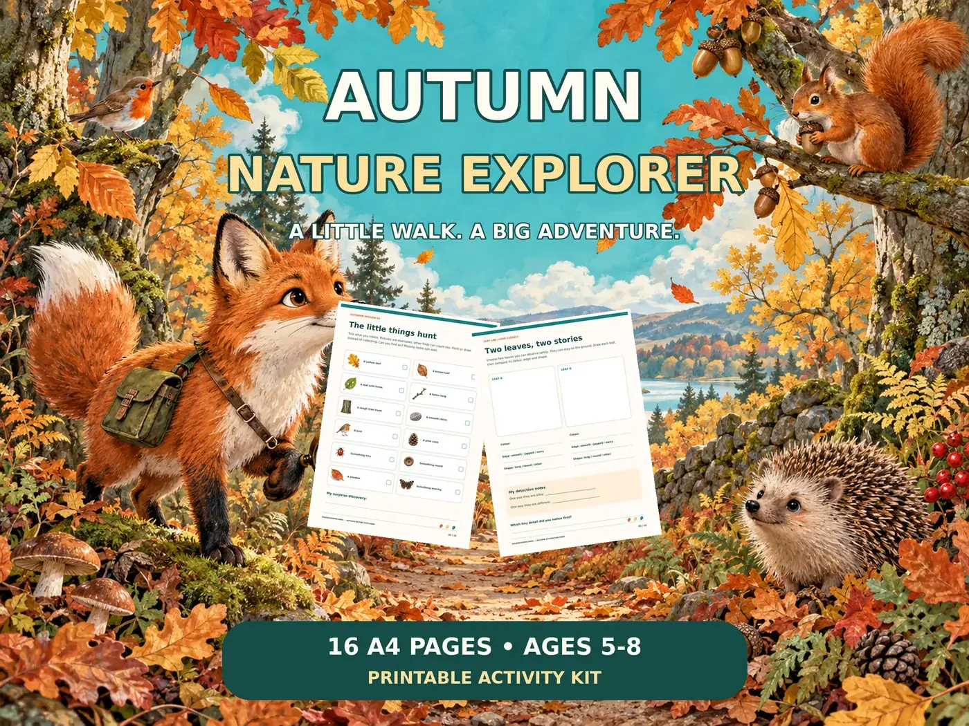
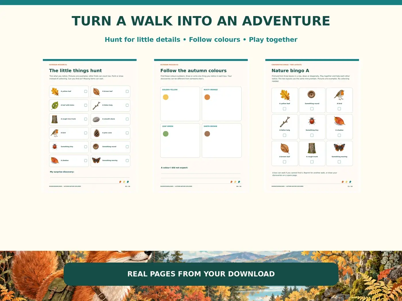
Our Autumn Nature Explorer includes a colour trail, leaf comparison, rubbing, counting and sound-map activities for ages 5–8 with grown-up support. These pages already provide different ways to notice a walk; use a few that suit the route rather than inventing an entire lesson around them.
Pair the colour trail with the Woodland Trust’s tree-identification guide, which looks at shape and other features. Two similar colours do not necessarily mean two leaves came from the same tree. Our short autumn nature-walk guide gives a manageable sequence for observing without collecting everything encountered.
Bring the observation indoors
For a quieter follow-up, choose a page from Botanical Mandalas and try the three-colour balance on its flowers and foliage. The pack includes colour-test circles, so the first experiment can happen before committing to a detailed design. It is an optional continuation, not something required for the walk.
Keep the original leaf photograph beside the finished palette. The useful connection is not that the colours must match perfectly. It is that a specific thing outdoors helped you make a deliberate choice indoors.
Explore Autumn Nature Explorer
More to read, make and discover
A few useful, interesting and checked routes into the subject.
- Further readingWoodland Trust: why leaves change colour
Pigments and weather behind autumn colour.
- Further readingWoodland Trust: first signs of autumn
A September 2026 guide to noticing seasonal changes.
- Further readingWoodland Trust: identifying trees
Look at leaf shape, edges and other features rather than colour alone.